People Experience Tool
2019 - starred.com

Product Context
Starred is a SaaS company that builds feedback solutions that empowers talent acquisition and HR teams to improve the user experience for corporate clients from day one to retirement.
The Challenge
To build a tool that helps you understand and improve your company's entire people's experience—from the day you are hired to retirement, puts you in control, and shows the value the right away
The Solution
Based on multiple iterations and user tests, we decided that the best solution would be to make an overview homepage. Our users can check there what had happened in the platform since their last visit and see the general people experience overview chart with filterable information, benchmark data, and real insights.
Deliverables:
Ideation sketches
Research
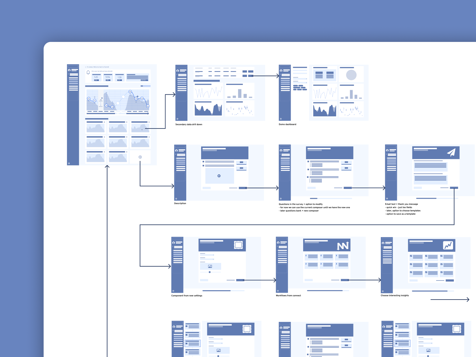
User flows
Wireframes
Low-fidelity prototype
Concept testings
Iterative updates design
High-fidelity prototypes
Usability test questionnaire
Usability test analysis—rainbow matrix
Documentation (design to development handoff)
Motion design
Establishing proper metrics and implementing them in Mixpanel
Internal demo video (included a 3D model and postproduction)
Quality assurance
UX assurance

Sometimes the best way to find the proper solution is to work on abstract entities. Creating user flows always put a lot of light to the problem and makes it easier to find satisfactory solutions.
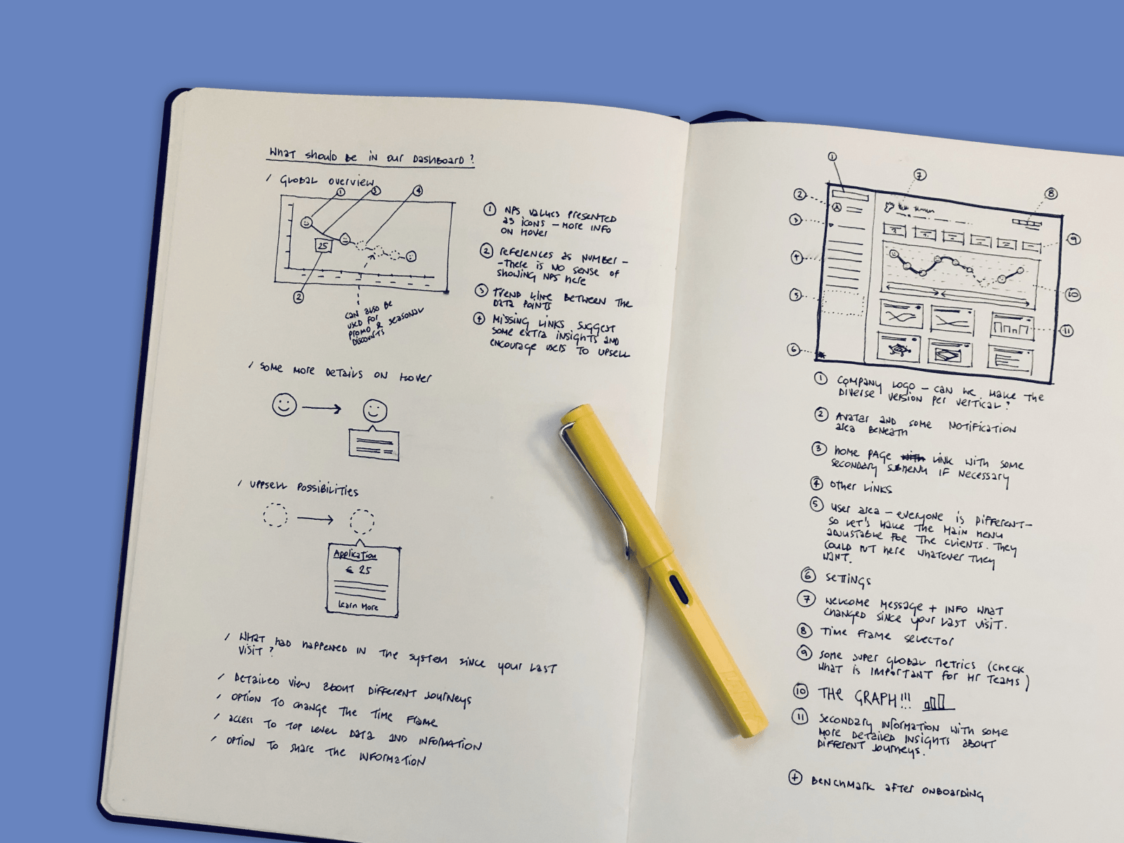
I always sketch a lot while designing. Sketching allows me to check and communicate design ideas with stakeholders and team members quickly, or as Le Corbusier said, “I prefer drawing to talking. Drawing is faster and leaves less room for lies.”

This low-fidelity design focuses on the critical actions that a persona will take while using a product. Its purpose is to map out the big picture, rather than describing interactions in detail.
Wireframes represent interface elements, navigation, and functionalities of the product. They are handy to map all of the user interactions.

A hover state reveals some extra information and actionable insights.
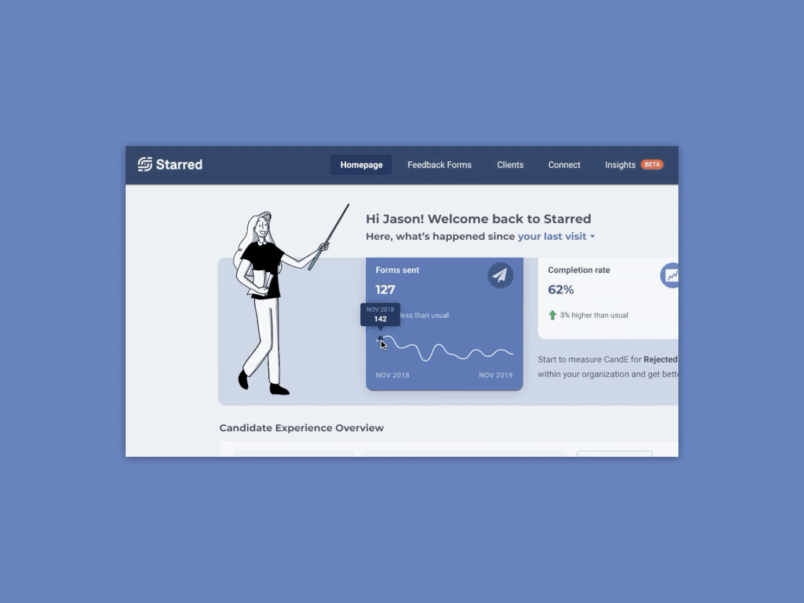
Users can check historical data by hovering on top of the small charts.


I prepared the documentation where I described all components and edge cases to discuss it with developers and incorporated it into the design system.

The close-up view of the chart.

One of the candidate experience actionable dashboard designI was working on - image by starred.com
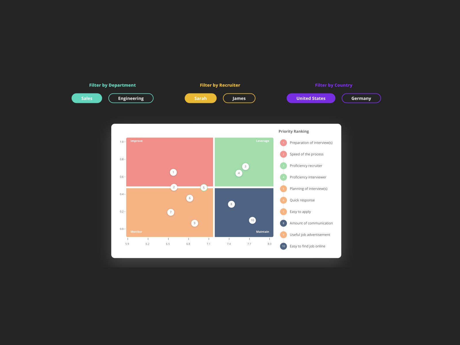
Priority Matrix design I was working on - it turns your candidate experience data into actionable next steps. Each recruiter, hiring manager, or other stakeholders will get an automated action plan to start improving - image by starred.com
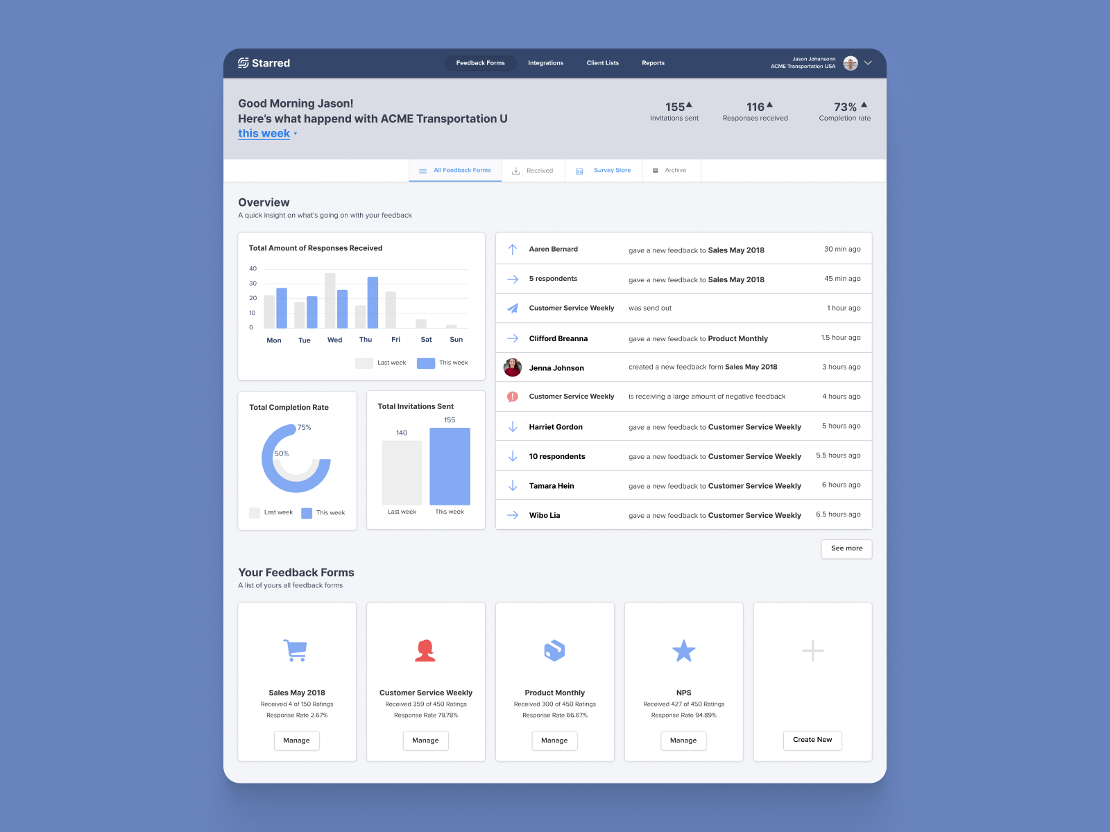
One of the dashboard design I was working on - user can have the overview of the status of the system on a first glance
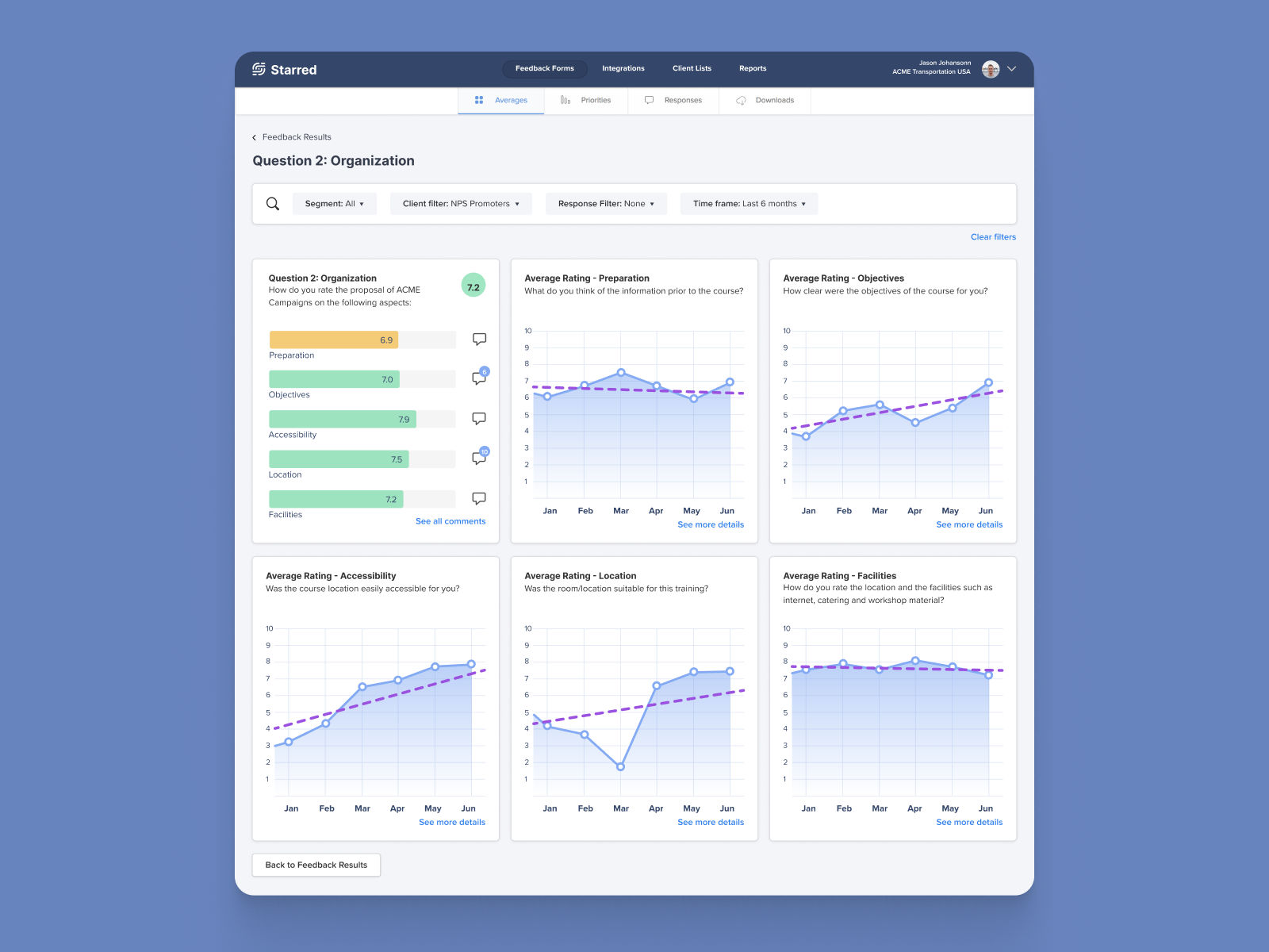
One of the dashboard design I was working on - user can dive into the details of each plot
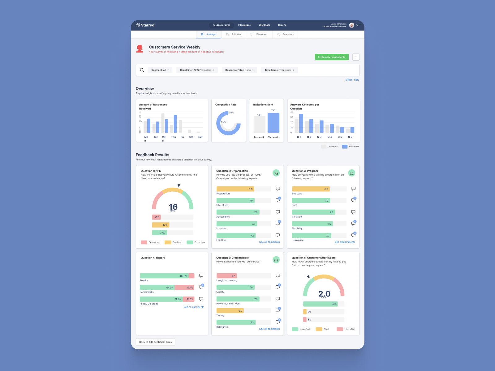
One of the dashboard design I was working on - feedback form summary dashboard

One of the dashboard design I was working on - priority matrix turns data into actionable next steps.