Feedback Form Redesign
2018 - starred.com
Product Context:
Starred is a SaaS company that builds feedback solution that empowers talent acquisition and HR teams to improve the people experience for corporate clients from the day they are hired to retirement.
The Challenge:
We want to make this app more appetizing for Starred users. In practice, this meant we wanted to provide even higher response rates. That was our starting point for the long journey of redesigning the respondent experience.
The Solution:
Our ambition was to provide similar experience regardless of screen size. Content should be readable and crisp on all of them.
Deliverables:
Ideation sketches
Research
User interviews
User analysis made with Google Analytics
User flows
Wireframes
Low-fidelity prototype
Concept testings
High-fidelity prototypes
Preference tests
Usability test questionnaires
Moderated and unmoderated usability tests
Usability test analysis—rainbow matrix
Feature prioritization framework
Documentation
Motion design
Design system
Establishing proper metrics and implementing them in Mixpanel
Sessions recordings and heatmaps
Metrics analytics
Quality assurance
UX assurance

I wrote two case studies about our redesign process

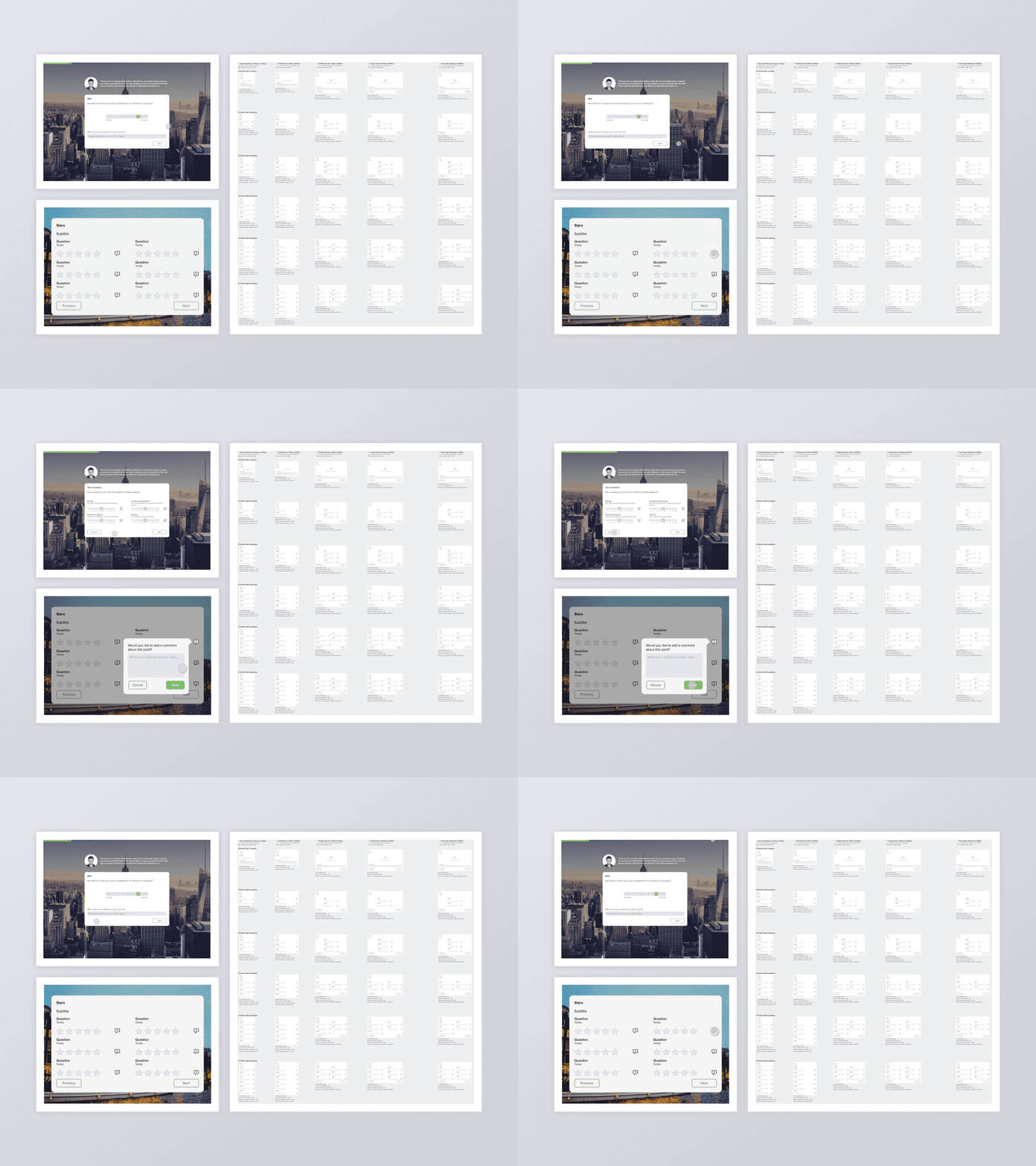
A survey preview on a tablet.

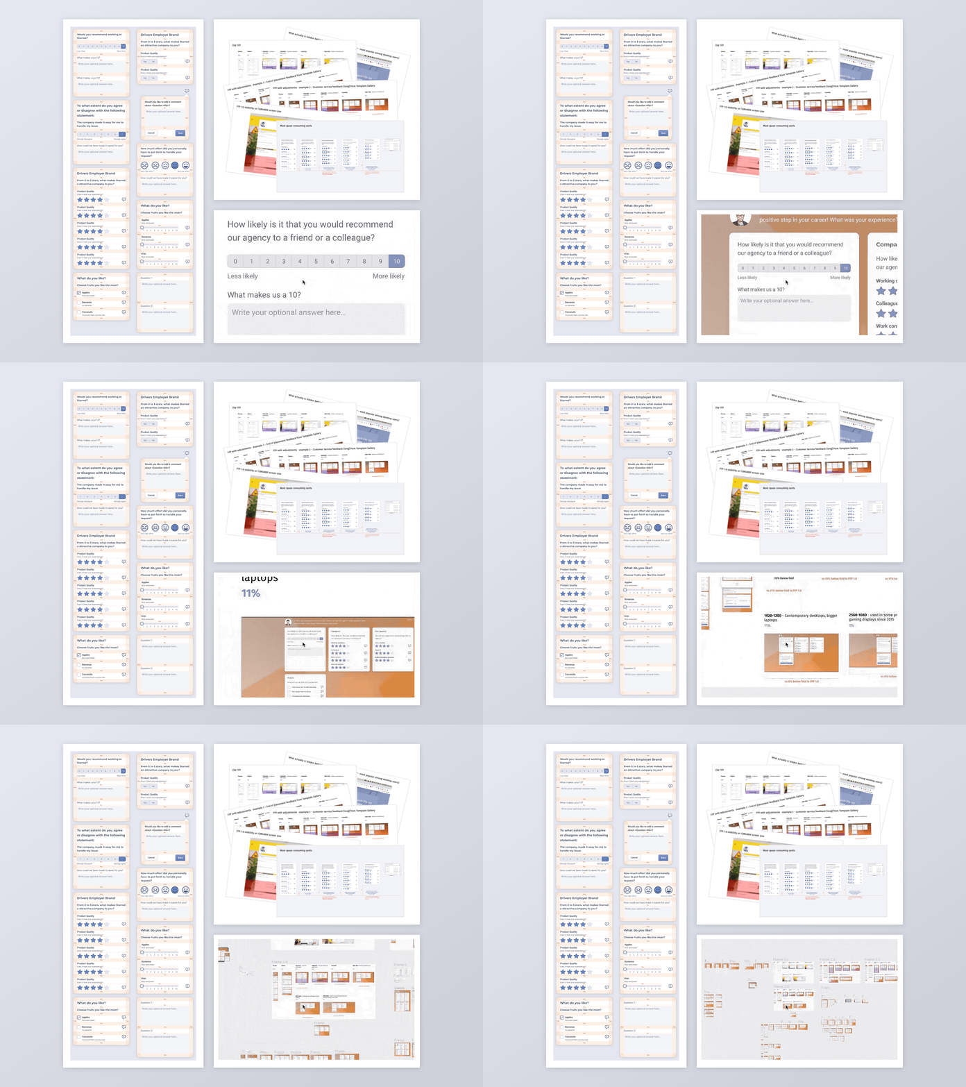
During the research phase, I checked among others multiple metrics, performed screen recordings sessions, and surveyed the users.

We used a lot of hand sketches and user flows proposals during the initial phase of the project.

We did multiple tests and formulated a few design hypotheses to be verified during usability tests. We also checked a lot of UI patterns to find the one that worked the best.

Subtle microinteractions provide friendly experiences for the users. We checked and documented every edge case of every component.

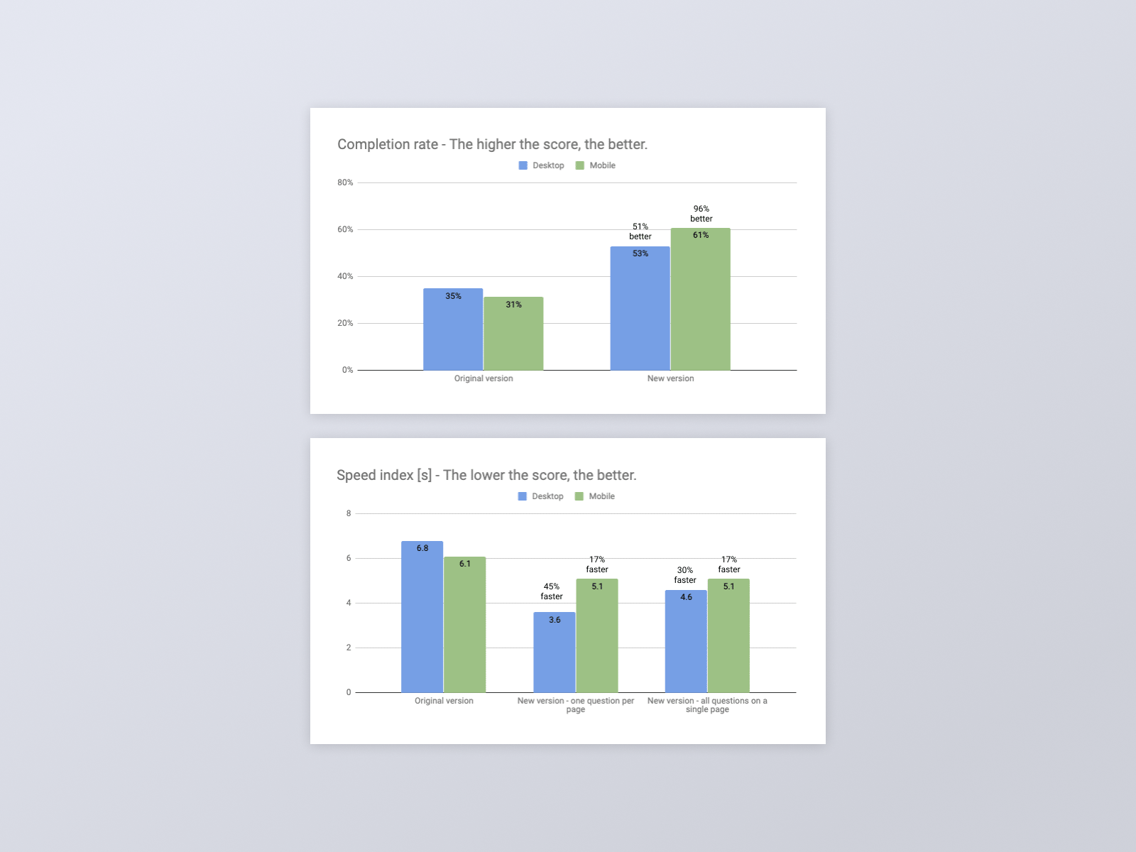
The new version of the feedback forms have many advantages for our clients. It helps them collect feedback and reach their business goals: • The total completion rate is almost 100% better on the new version of the feedback form. • Respondents tend to leave 22% more comments on the new feedback form page. • The new version opens noticeably faster than the original one.

A survey preview on a tablet.

We used multiple user testings methods for this project including preference tests, moderated and unmoderated usability tests, accessibility tests, and loading speed tests—resulting in satisfactory experiences for end-users.
